Charts are graphical presentations of price information of securities over time. Charts plot historical data based on a combination of price, volume as well as time intervals.
The use of charts is so prevalent, that technical analyst is often referred to as chartists. Originally, charts were drawn manually, but a majority of charts nowadays are drawn by computer.
Chart Types
The main chart types used by technical analysts are the line chart, bar chart, candlestick chart, Renko Chart, Point-and-Figure charts, etc. Charts can also be presented on an arithmetic or logarithmic scale. The types of charts and the scale used depend upon what information the technical analyst considers to be most important, and which charts and which scale ideally shows that information.
Line Charts
Line charts are the most basic form of charts, They are composed of a single line from left to right that links the closing prices. Generally, only the closing price is graphed, presented by a single point.
This is a popular type of chart used in presentations and reports to give a very general view of the historical and current direction.
It is clear as well as a simple way of getting a general idea of the price movement’s direction in the market, which is preferred by some traders.
While this kind of chart doesn’t provide much insight into intraday price movements, many traders consider the closing price to be more important than the open, high, or low price within a given period.
Bar Chart
One of the basic tools of technical analysis is the bar chart. Bar charts are also referred to as open-high-low-close (OHLC) charts. They are comprised of a series of vertical lines that indicate the price range during that Time Frame.
Bar charts enable traders to discover patterns more easily as they take into account all the prices, open, high, low and close. The opening price is the horizontal dash on the left side of the horizontal line and the closing price is located on the right side of the line. If the opening price is lower than the closing price, the line is often colored black (or green) to represent a rising period. The opposite is true for a falling period, which is represented by a red color.
Candlestick Chart
Another kind of chart used in the technical analysis is the candlestick chart, so-called because the main component of the chart which represents prices looks like a candlestick, with a thick ‘body’ and usually, a line extending above and below it, called the upper shadow and lower shadow, respectively.
The top of the upper shadow represents the high price, while the bottom of the lower shadow shows the low price. Patterns are formed both by the real body and the shadows. Candlestick patterns are most useful over short periods of time, and mostly have significance at the top of an uptrend or the bottom of a downtrend, when the patterns most often indicate a reversal of the trend.
The wider part of the candlestick is shown between the opening and closing price. It is usually colored in black/red when the security closes on a lower price and white/green the other way around.
The thinner parts of the candlestick are commonly referred to as the upper/lower wicks or as shadows. These show us the highest and/or lowest prices during that timeframe, compared to the closing as well as opening price.
The relationship between the bodies of candlesticks is important to candlestick patterns. Candlestick charts make it easy to spot gaps between bodies.
A slight drawback of the candlestick chart is that candlesticks take up more space than OHLC bars. In most charting platforms, the most you can display with a candlestick chart is less than what you can with a bar chart.
Renko Chart
Unlike the other Charts, the Renko Chart is a noise-less charting technique that concentrates merely on price movements, completely disregarding time and the usage of volumes.
This Chart consists of white/green and black/red bricks. These are placed depending on whether the price rose or not compared with the previous brick. If it did by enough value, established by the brick size, a new one is placed. White/Green bricks are used when the price of the security goes up and black/red bricks when they go down.
It is important to mention the fact that a new brick is only placed under certain volatility criteria, either resulting in a major advantage or disadvantage for traders. It can be placed in a matter of minutes or take more than a day depending on market conditions. On the one hand, this may be advantageous. Specifically for traders who desire a simple way of identifying supports and resistances, the overall trend and filter noise. On the other hand, this can make market sentiment hard to determine. Consequently rendering the usage of other analysis tools useless.
For more details, check out our video on “Understanding Chart Types – Basic Charts” for an in-depth look into this topic :
In Hindi
In English
Heikin Ashi
Heikin Ashi is a kind of trading chart that originated in Japan. Heikin Ashi charts are similar to candlestick charts in that the color of the candlestick denotes the direction the price is moving.
Heiken Ashi charts are able to show the uptrend and downtrend more clearly. A strong uptrend exists when there are continuous green HA candles without the lower shadow. A strong downtrend exists when there are continuous red HA candles without the upper shadow.
The main difference between candlestick and Heikin Ashi charts is that the HA charts average price moves, creating a better appearance. Because the HA price bars are averaged, they don’t show the exact open and close prices for a particular time period.
Heikin Ashi charts can be used independently though, especially by swing traders or investors. Day traders tend to use Heikin Ashi charts more as an indicator.
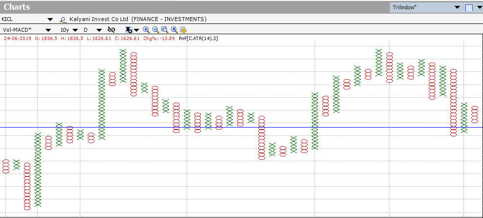
Point and Figure Charts
Point-and-figure is not very well known or used by the average investor, but they have a long history of use dating back to the first technical traders. These simple charts only focus on the significant price moves, while filtering out ‘noise’.
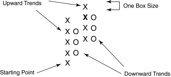
Point & Figure charts consist of columns of X’s and O’s that represent filtered price movements. X-Columns represent rising prices and O-Columns represent falling prices. Each price box represents a specific value that price must reach to warrant an X or an O. Time is not a factor in P&F charting. No movement in price means no change in the P&F chart.
There are many varied ways to mark P&F charts from using just the close or the highs and lows. The box size can be set to be a fixed value or a set %. The construction of point-and-figure charts simplifies the drawing of trend lines, and support and resistance levels, which is why point-and-figure charts are ideal for detecting trends, and determining support and resistance levels.
Conclusion
To sum up, each chart has its own utility. However, their usage depends on the type of trader you are and strategies that you prefer to put in practice. So, having a general knowledge of the options you have when it comes to analyzing security’s behavior is an advantage.
Want to try out different Technical Analysis Chart Types?
Click on the button below to download a Free 7-day trial of Investar:


Iam intrastate
Very Nice Information